Case study · Client project
Role
Lead UI/UX Designer (client project)
Platforms
iOS & Android (Polish market)
Timeline
2024 – 2026
Scope
Product design, design system, interaction logic, developer handoff, testing


Context
Psychia is an AI companion for emotional support. You can talk to it by text or voice, come back to past conversations, read short articles and use guided relaxation.
It started as a web app with a user panel, a specialist panel and video consultations. It worked, but it wasn’t where people needed it. Reaching for a browser when you’re anxious at 2 am is one step too many. We moved to mobile to make Psychia faster to reach and easier to use every day.
My role
I was the only designer on the product. I designed both the web app and the mobile app from scratch, built the design system, defined the interaction logic and worked with the developers through handoff and testing. I also redesigned the web acquisition flow and built the marketing site in Framer.
The problem
The web app worked, but the data showed where it broke. Many users dropped off right after signing up. Almost nobody used the option to save the web app to their home screen. And testers kept telling us the same thing: they used Psychia on their phones anyway – in a mobile browser that felt clumsy because of browser limits, especially in Safari.
Psychia needed to be a real app: one tap away, at 2 am, without a browser in the way.


The goal
At launch the priority was awareness: get as many people as possible into the app and be able to stay in touch with them. Every design decision in the onboarding was measured against one question – does it bring people in and give us a way to reach them again?
Key decisions
1. Start with a feeling, not a form
The first screen asks one question: what are you feeling today? On the dashboard, quick-start topics like “I’m tense” or “I can’t sleep” help people who don’t know how to begin.

2. Moving the free trial behind sign-up
Insight: in the first mobile version anyone could chat for free without an account, with message limits and nudges to register. Lots of people used it – and never signed up, so we had no way to reach them again.
Decision: I moved the free trial behind a quick, free registration. Create an account first, then get your free conversations right away.
Result: sign-ups grew by 56%, and every new user could now be reached with onboarding and marketing emails.


3. Memory you can see and edit
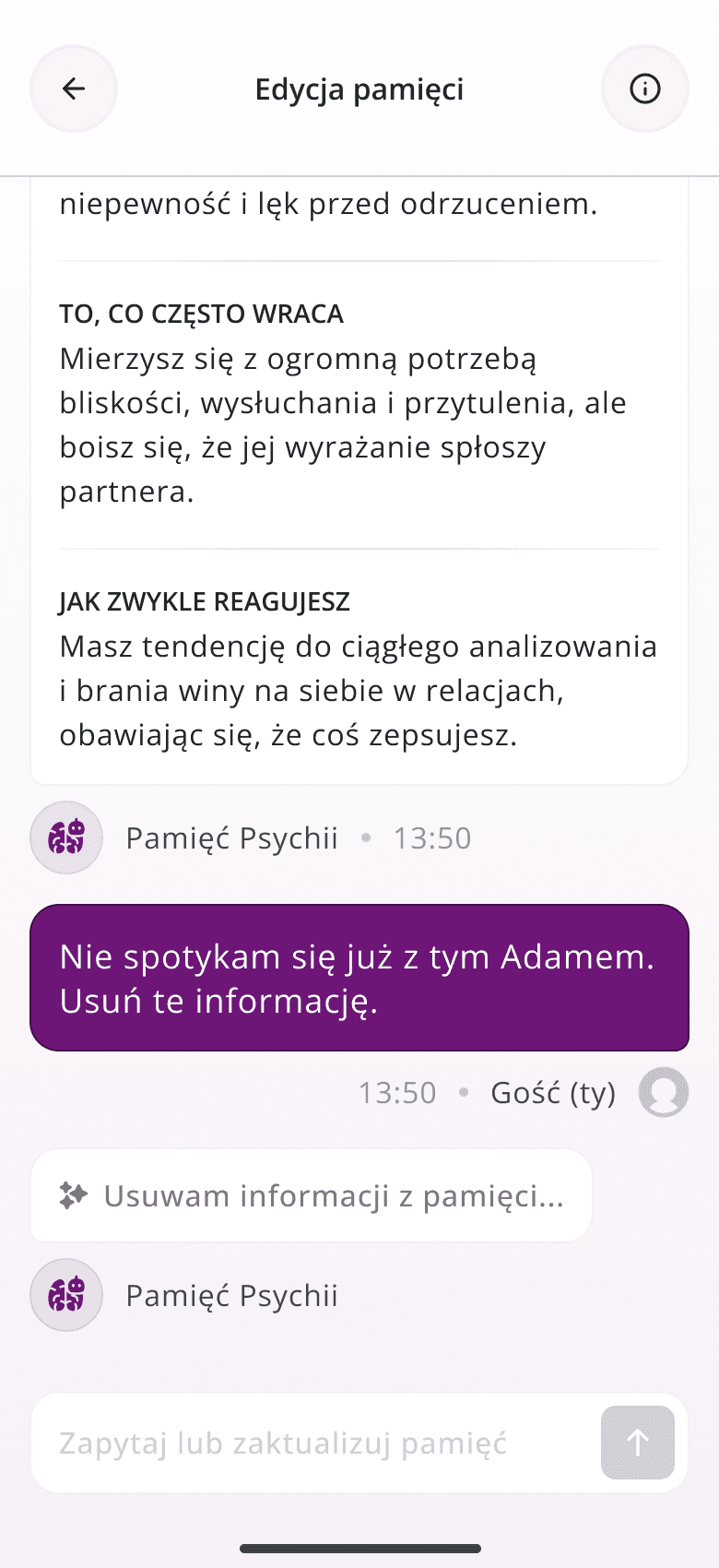
Psychia remembers context between conversations, which is useful but also sensitive. I designed a memory view where you can read what the AI knows about you, grouped into clear categories, and change it just by asking (“I don’t see Adam anymore, remove this”). The AI shows what it’s doing while it updates.


4. Circle of Trust


01
Who is speaking
Every participant has their own colour, avatar and name. Psychia’s messages look clearly different from people’s.
02
Getting everyone in
A waiting room with an invite link and live states: joined, disconnected, left. Guests only need a free account.
03
Private mode
A private mode toggle switches the whole chat to a dark state, so you never send something to the group by mistake.
04
Keeping it safe
The organiser can pause the talk, remove a participant or close the session – each with its own clear screen.
5. Text, voice and the space between conversations
Text chat, voice chat with clear listening / thinking / speaking states, guided relaxation with timers, and short articles. Plans (Lite, Go, Plus, Max), trials, promo codes and usage limits were designed end-to-end, including every success and error state.


Design system
One system behind 200+ screens and states: colour ramps built on Figma variables, two typefaces – Bogart for headings and larger text, Open Sans for body copy and UI – and shared components used on both platforms.

Outcome
The launch goal was awareness. Moving the free trial behind sign-up increased registrations by 56%, and within a few months Psychia built a solid base of users we could reach with email campaigns. Today the app is live on iOS and Android with ~1,540 registered users in Poland and a 4.4 rating from 12 reviews.
What I learned
Content belongs where people already read
The in-app blog didn’t work. People read articles on the product website, not inside the app. Next time I’d replace long articles with short illustrated guides – a few swipeable cards on breathing, falling asleep or calming down before a hard conversation.
Don’t give everything away up front
Our first free trial without an account gave too much too early. Even with limits and nudges, people didn’t see a reason to sign up. Asking for a free account first – and giving value right after – worked far better.